Etex
Eternit & Euronit: a century of heritage focused on the future
A rebrand and repurposing of the Eternit and Euronit building products brands for Etex (Belgium/international).
Eternit is one of Europe’s most recognised names in fibre cement – a brand with over a hundred years of history, operating across multiple markets as part of Etex, a global building materials group with operations in 45 countries. In some markets, the brand operates as Euronit – same parent company, same heritage, different name.
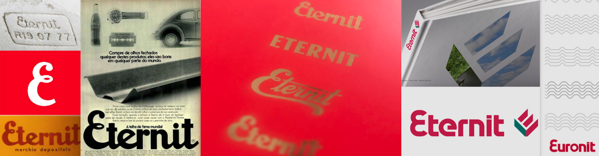
That heritage is an asset. But across markets, the two brands had evolved independently. Different visual assets, different brand marks, different interpretations of what the brand stood for. Early Eternit marks had been expressive and characterful, but more rigid interpretations, and successive local adaptations, had created a fragmented picture. There was no single, coherent identity system connecting the brands across their European and LATAM markets.
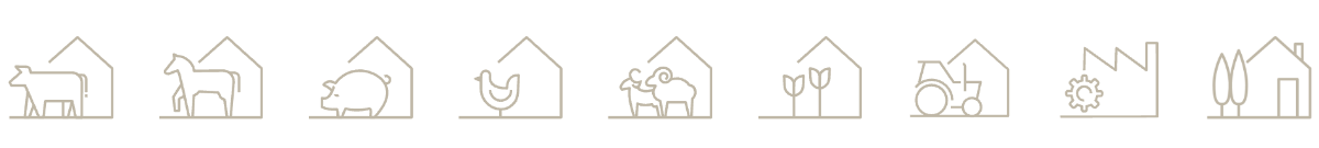
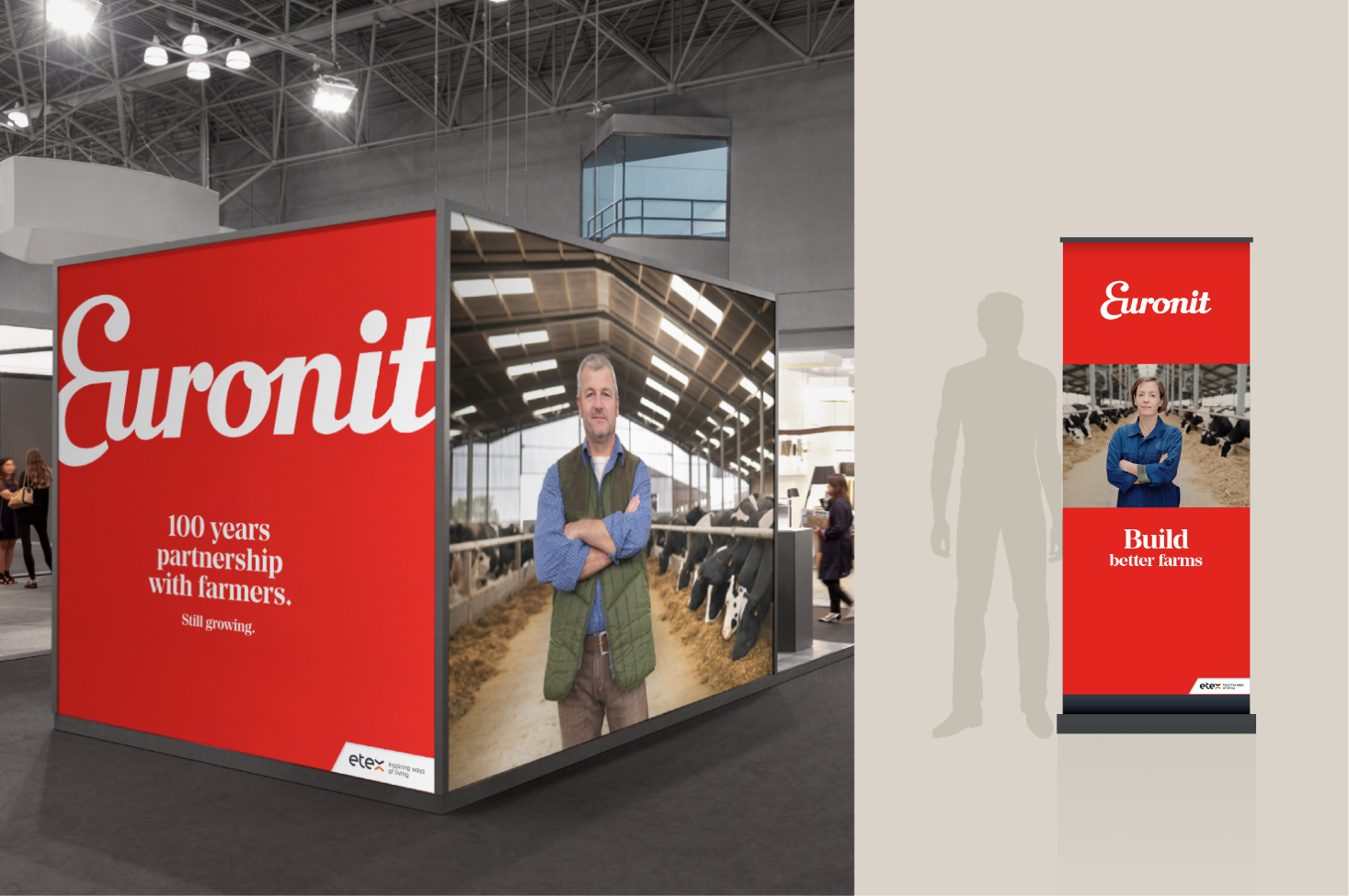
At the same time, the business was repositioning. The future for Eternit and Euronit lay in specialist agricultural markets – roofing and cladding solutions tailored to progressive farmers, with a growing focus on animal health and welfare. The brands needed to reflect that shift: less generic building products, more specialist partner to the farming community.
Collaborative partnership
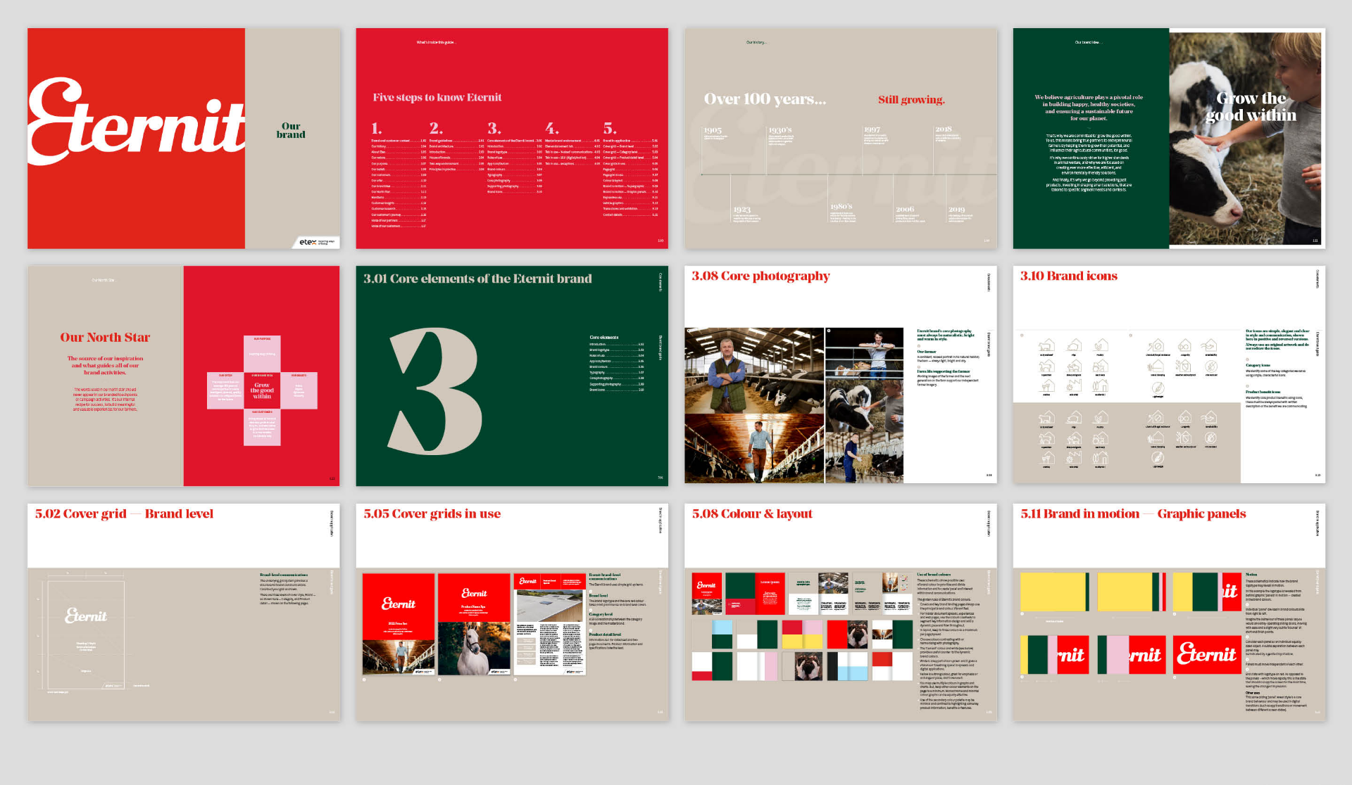
Working with global brand strategy expert Natalie Reid McEvoy, we set about repositioning Eternit and its sister brand Euronit for a more responsive, human-centred future. Following workshops with the core Etex team, my role was to take that strategic direction and make it tangible – designing the visual identity, crafting the voice, and building a system that could work across markets.
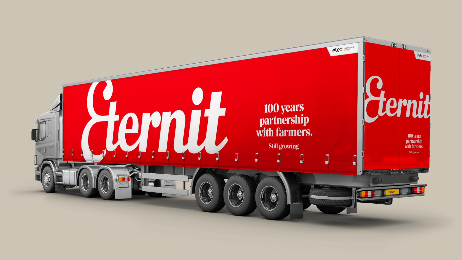
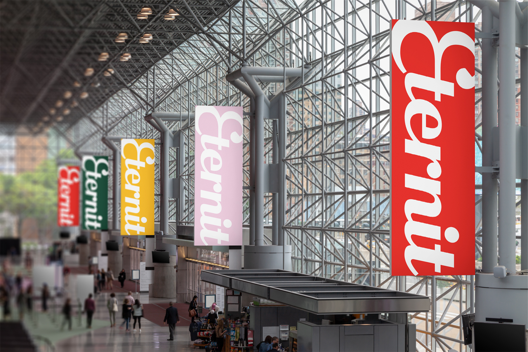
My starting point was their archive. Those early brand marks had a spirit worth building on – warm, expressive, confident. Recent iterations had lost that. The challenge was to create an identity system that honoured the legacy while unifying the visual language across markets. Not one identical look everywhere, but a coherent framework that makes Eternit and Euronit feel like part of the same family – each with its own expression, both clearly connected. Simplified, warm, and built to flex across the applications a pan-European brand requires.
Voice followed the same principle. Less corporate distance, more human connection. Language that reflects genuine expertise in agricultural building and animal welfare – a voice that could speak credibly to progressive farmers, not specifiers reading data sheets.
What I brought
My starting point was their rich archive materials. Early Eternit marks had a spirit worth reclaiming – expressive, confident, distinctive. Recent iterations had lost that. The new identity needed to honour the legacy while feeling thoroughly modern: simplified, warm, and built to flex across the applications a pan-European brand requires. The approach reflects the brand’s new focus – partnership with farmers. And, genuine expertise in animal welfare and building performance – not just product specifications.
The result
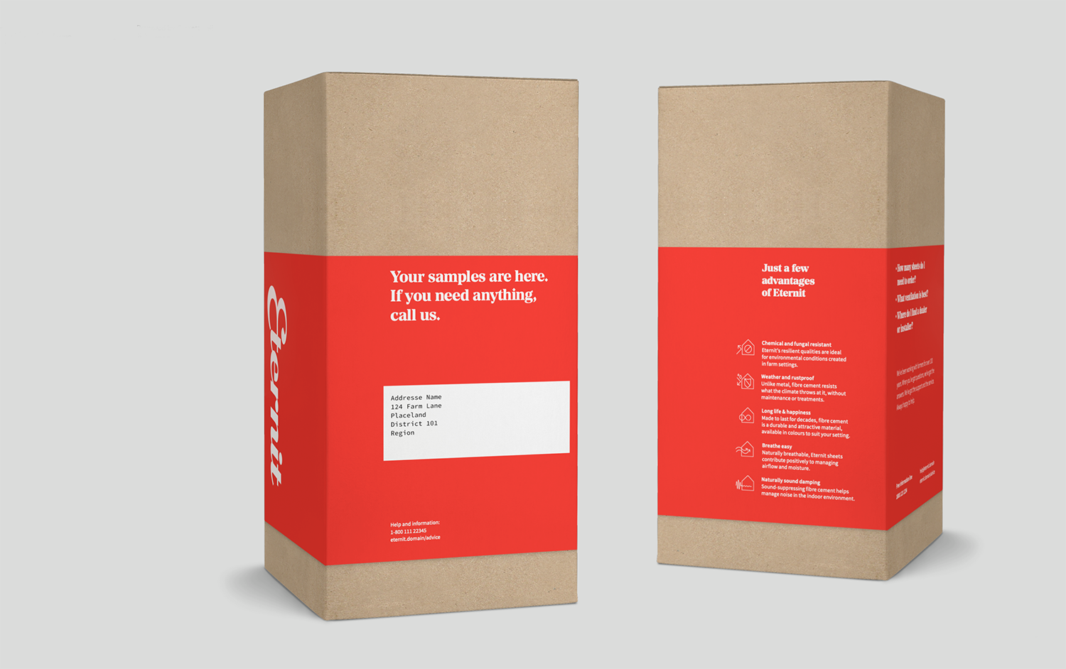
A unified visual identity and verbal system that brought both brands together for the first time. Expressive, warm and contemporary – built to work across digital and physical applications while giving every market a consistent foundation and the flexibility to make it their own.
FROM: Two related brands operating independently across European and LATAM markets – fragmented visual identities, no coherent system, and a business repositioning for a new future.
VIA: Reclaiming the warmth and character of the original brand heritage, guided by a strategy focused on progressive farming and animal health.
TO: A coherent brand identity system for Eternit and Euronit – unified across markets, positioned as specialist agricultural partners, and built to grow.
His insights and creative mind meant a lot to me in this transition, and I am convinced he contributed heavily to bringing this rebranding alive and creating a success out of it. I can definitely recommend working with Garrett, because of the way he wraps his head around the topic, thinks about the strategic direction in a visual way, expresses it when he does not like one or the other development, but also advises possible solutions and a clear way forward.
Etex
— Before

Description:
A rebrand and repurposing of the Eternit and Euronit building products brands for Etex (Belgium/international).
Intent:
Repositioning legacy brand as a specialist Agri-focused product, tailored to the unique needs of progressive farmers
Who: