XO Tile
Let’s play surface
A new name and brand strategy to reposition a leading tile and flooring importer and retailer
Okay, sometimes surface is a strategy
Importer/retailer National Tile had a showroom in of Dublin's architectural heartland. Prime location. Great product range. But architects and designers walked past every day without registering it as anything memorable.
The problem wasn't the tiles.
A generic name. A dated visual identity. Another business competing on price. Nothing unusual there.
The strategic insight
Here's what I observed about the customer. They weren't just ticking a box – buying tiles. They were making creative decisions about spaces that really mattered to them. Whether a homeowner refurbishing a high-end property or an interior architect specifying for a client, choosing elegant surface finishes is a moment of personal expression. It's an investment. It shapes how a space feels.
But like the competition, National Tile was talking about price per square metre. Unlike the competition, the advice on offer was second to none (if you cared to step inside).
The shift was straightforward: identify this unique difference, stop selling commodity, start celebrating creative choice.
- FROM: A generic name and visual identity trapped in the past, underperforming and overly focused on price.
- VIA: Choosing finishes can be a key creative moment in a project. It's personal expression and an investment in the future of a build.
- TO: Pivot from price to a celebration of creativity, surface and the joy of expression.
Finding the articulation
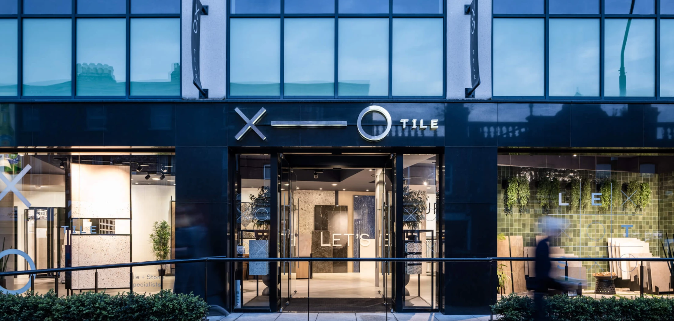
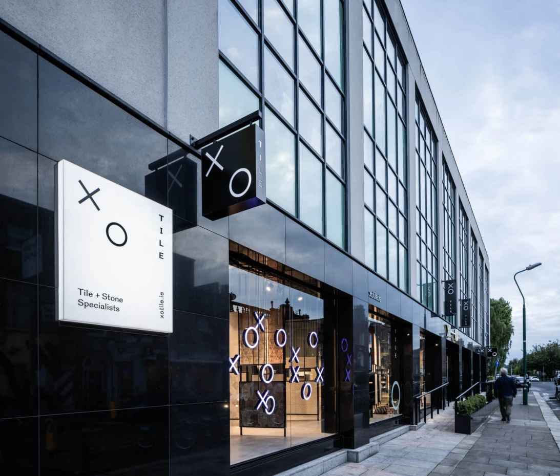
I created and presented multiple name directions, then we chose two, to present as visualised identity concepts. The client chose XO – not simply because it was clever, but because it genuinely captures the strategy in a way that would engage our audience.
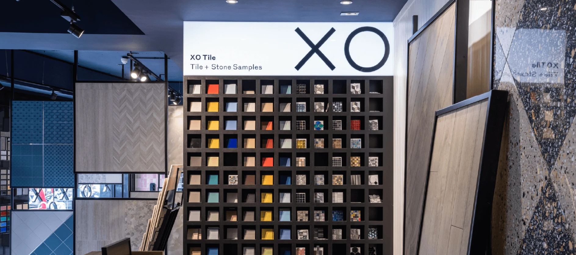
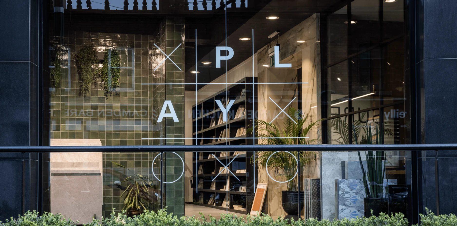
XO – a game played on a grid. Simple rules, infinite variations
The name and its visualisation makes the positioning tangible.
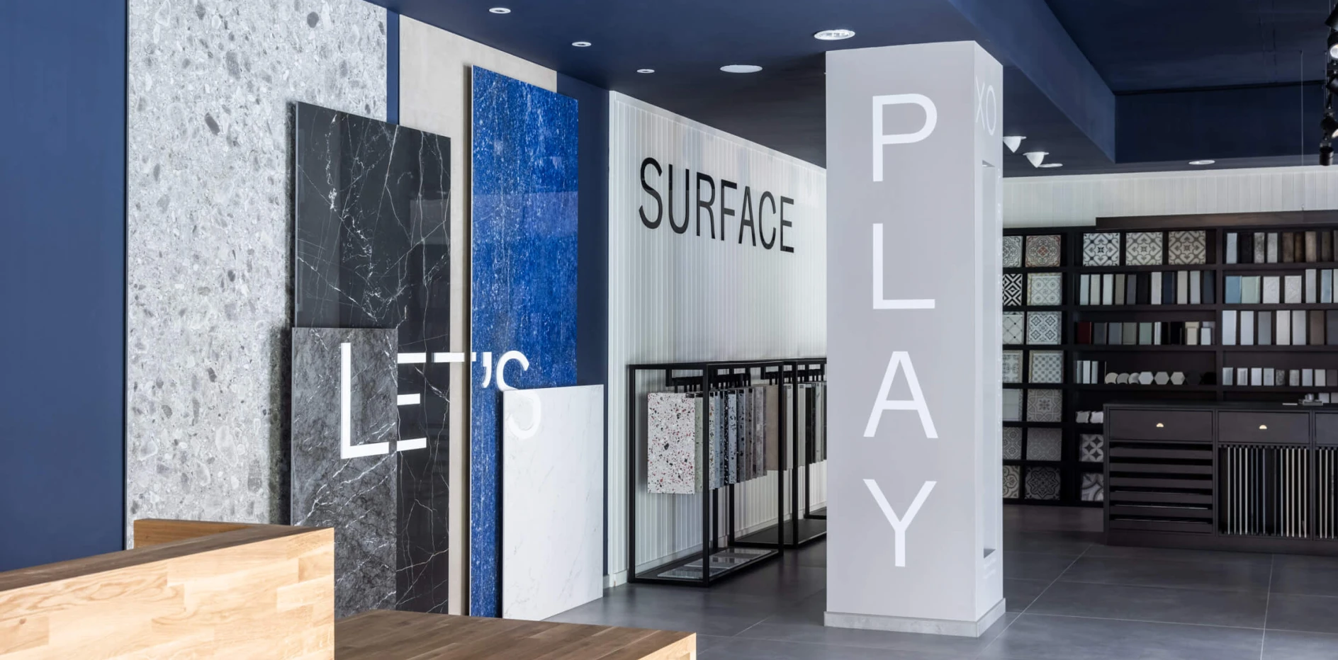
The tagline ‘Let's play surface’ – makes it explicit.
The positioning: Champions of better surfaces. We love the variety of practical, creative, functional and expressive stone and tiles that we can source for your projects.
Not a commodities supplier. Your creative partner.
The identity as proof of concept
The visual identity system was built on the ‘game played on a grid’ concept. Modular elements that playfully flex and adapt depending on application – infinite possible combinations reflecting creativity and the breadth of choice XO Tile offers.
This isn't mere decoration. It’s the strategy made visible. The identity needed as much impact in digital applications as in physical spaces, so the modular approach allowed movement and play online while keeping print applications fresh through variation.
Surface textures in the photography and in print – ridged, cracked, embossed – become hero elements. Not product shots. Not showroom images. Just beautiful, tactile surface that make you want to touch it.
Why it works
The rebrand gave the sales team something to sell beyond specifications and pricing. It shifts the conversation from simply ‘how much?‘ to ‘what can we create?’ It celebrates the customer adding their finishing touches – to what can be a long and stressful building process – and puts the brand at the joyful heart of it.
Perhaps most importantly, it makes the brand memorable. When an architect is specifying tiles for a project three months later, they're not trying to remember ‘that tile place near the studio.’ They're remembering XO.
Following the strategic framework – Positioning, Purpose, Principles, Personality – means every touchpoint reinforces the same idea. The name, the visual system, the messaging, the way staff talk about what they offer. It all ladders back to the same strategic territory.
- The challenge: Repositioning a tile supplier/importer with a generic name and brand
- The insight: Surface choice is creative expression celebrating project completion, not a commodity purchase
- The expression: XO Tile | Let's play surface
- The approach: Strategic naming + modular identity system reflecting ‘infinite variants on a grid'
XO Tile
— Before
Description:
A new name and brand strategy to reposition a leading tile and flooring importer and retailer
Intent:
Force reappraisal with a new distinctive brand to appeal to creative architects and their most discerning clients
Who: